rothko blue
- Apr 9
- 2 min read
Updated: Apr 16
It seems as if I have always had quite a bit of history with this particular color blue. So many periods have been accented by it in some way or another so it was only fitting for me to fill a canvas of it in tribute. Going back to my childhood, it was the color of the high school and junior high in my town and I remember always looking forward to being able to wear it. That had its natural transition of not liking it for some years as I was trying to distance myself from that association as I was finding my way in my early twenties. As I was in Spain, the color started to take on a new meaning. It was the color of the tiles, the color paint that came from lapis lazuli, the color of the Mediterranean Sea. Though it took some time to start wearing it again, I was finding my new appreciation for it. It was a thread connecting the familiarity of home and the vast world I was starting to explore.
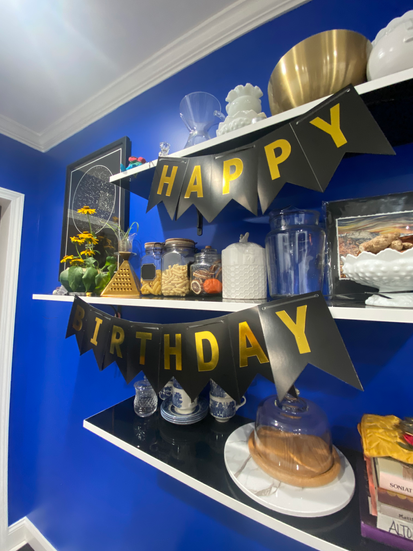
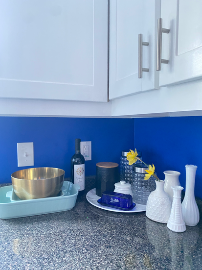
By the time we moved into our house in 2021 and trying to decide on a kitchen wall color, I kept coming back to this color blue. I could not of been happier that Blake was in agreement for a bold color choice. Since I mainly work in a very monochromatic way in the studio (clay/grey, plaster/white) having a big color in the house felt so good. If we could've gone full Monet with it, I would have! His house in Giverny, France will always be a source of inspiration. (this is a link :))
This past winter we decided it was time for a change in the kitchen but I knew I had to have that blue show up somewhere else now because of how much joy it has brought me over the years.
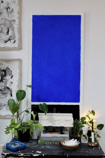
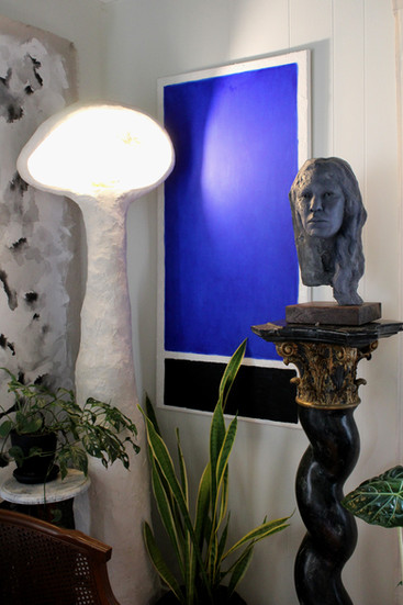
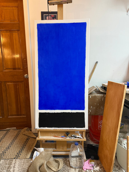
My original thought was to just do the entire canvas solid but after last summer's trip to New York City and seeing a Rothko in person for the first time- an ode to the man himself made most sense.
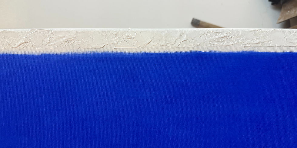
I love the way oil paints have such depth and luminosity to them. By using three different modes of applying paint, I was able to achieve the texture differences that Rothko explored while keeping it still a bit my own in application. It wasn't my intention to copy him exactly but to evoke the same feeling his work brings out in me. Having this canvas hanging now gives me such joy and a sense of grounding. Some might say those two lines of thought might not go together for energetically they go in different directions but I believe it is in those moments of balance when ideas become boundless.
I decided to entitle it 'rothko blue' as a node to my inspiration but also I was thinking of the Robert Glasper and Erykah Badu song of 'Afro Blue' that I sung to myself many times over while doing the layers of oil paint.